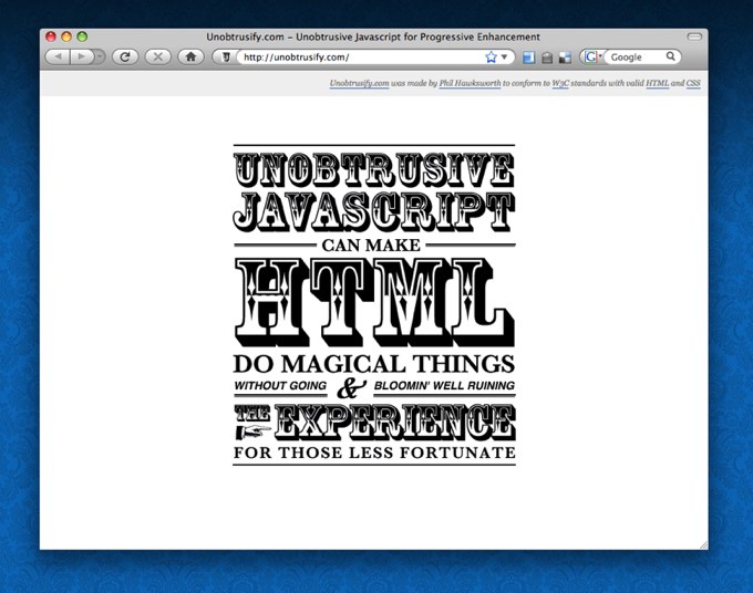
Recently Jon Lister, a colleague of mine at Osmosoft showed me a website made by his friend Joshua Bradley. The site, used some of the Javscript code from TiddlyWiki's animation engine to create some nice visual effects. I loved the design, but could see some room for improvement in the implementation. I'm a big advocate of Unobtrusive Javascript and Progressive Enhancement and so I set about producing a quick demo of how a similar result could be achieved in the most Web-kind and accessible way available using jQuery for the behaviors.

The result has been published as unobtrusify.hawksworx.com.
The aim.
- Create a similar effect to that on Josh's site, but make sure that the page is readable without Javascript.
- Use images to make the headings look snazzy, but make sure that they are not required in order for the content to make sense.
- Use only unobtrusive Javascript and keep the HTML as clean as possible.
- Reduce the number of http requests required to as few as possible in order to improve performance.
The approach.
First of all, I wrote the text for the page. I chose a simple statement and tried to structure it such that it would make sense regardless of which sections were expanded.
Then I used the simplest HTML markup I could to logically represent the content with its various headings. This is how the page would look to text-only browsers search engines, web-crawlers and screen-readers.
I then used a well-known CSS technique to replace the text in the headings with images. This would ensure that the text would remain for non-human consumers of the site, while the images would be presented to those able to appreciate them. The technique is simple. You prevent the browser from scrolling the content of your element with overflow:hidden and then scoot the text out of the way with text-indent. Now that the way is clear, you can display an image with background-image. Be sure to specify the dimensions of your desired image as the background-image property will not resize your element to the correct size automatically. The CSS would look something like this:
#myHeading {
    text-indent: -9999px;
    overflow: hidden;
    background-image: url(myImage.gif);
    width: 380px;
    height: 123px;
}
My content had 6 headings to render in this way. I also wanted to have a mouseover effect to give some affordance for the click-ability of the headings so this would require another 6 images. Rather than having 12 images to download (which would require 12 separate HTTP requests), I combined all of these images into a single image. This would have a number of effects. Firstly, combining the 12 images into one meant that the total download would be a bit smaller due to the way that the file was compressed. (A tiny saving, but every little helps.) Secondly, there is an overhead with making HTTP requests so when it comes to performance, the fewer the better. This method cuts out 11 HTTP requests. Score! Thirdly, as the browser uses the same image for the original heading images and their associated mouseover images, there is no need to preload the alternate images to avoid that nasty pause when mousing over. The image is already downloaded and ready to display. A nice bonus.
In order to use this 'image sprite' for each and every heading, I just needed to specify the background-position for each one. Some attributes would be common to each one so I could save some code like this:
h1 {
    text-indent: -9999px;
    overflow: hidden;
    background-image: url(images/unobtrusive_sprite.gif);
    width: 380px;
}

h1#uj {
        background-position: 0 0;
        height: 123px;
}

h1#cmh {
        background-position: 0 -123px;
        height: 150px;
}
...
At this point our page looks like this. This is exactly how we want things to appear for those without Javascript. There is no ability to toggle the display of the various sections, the content is shown in full, and there is no mouseover behavior on the headings to suggest that they can be clicked (since they cannot). This is the essence of Progressive Enhancement. We have a perfectly serviceable web page (albeit a simple one) which we can now enhance for those with Javascript enabled.
Using jQuery to easily and unobtrusively add behavior to elements on the page, we can now hide all of the expanded sections. We do this with a simple jQuery statement like this:
$('#wrapper > div').hide();
This hides all of the div elements which are a direct descendent of the element with an ID of wrapper. (my chosen HTML structure).
Headings are not by default clickable so we can add some behavior to suggest that the clicking a heading will have a effect by changing the cursor for them like this:
``` $('#wrapper h1').addClass('clickable'); ```
A CSS class of 'clickable' specifies the cursor with cursor: pointer;
We also use jQuery to show the hover image by just repositioning the background image when we hover with the mouse and also to show the hidden div element when we click a heading. Remember, none of this will happen unless Javascript is available.

I also use an additional trick to prevent a flash of unstyled content or FOUC (gratifyingly pronounced 'FOOOOOOK' by John Hicks) while the Javascript is being downloaded. This trick is very well explained by Karl Swedberg on the excellent learningjquery.com site.
For a better picture of exactly what is going on, why not swing by unobtrusify.hawksworx.com and exercise your right as a citizen of the Web to view the source. Hitting View Source is so often the best way to learn how things are done. Go on! Go and get your hands dirty!